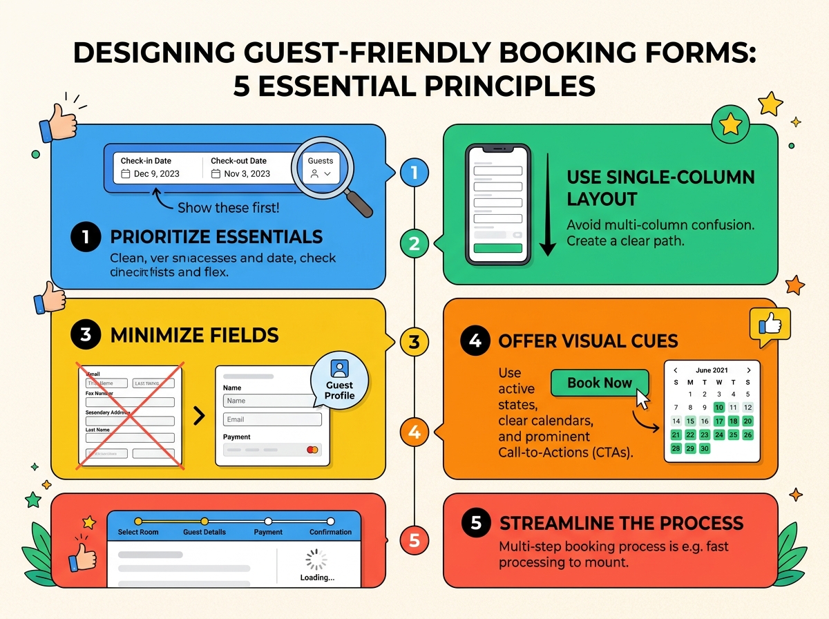
Key Takeaways
- Ask only for details needed to complete the current booking step.
- Use plain-language labels and arrange fields in a natural order.
- Design for one-handed mobile use, readable text, and large controls.
- Show helpful field-level errors before visitors reach the final submission step.
- Make availability, total cost, payment timing, and policies easy to find.
- Build accessibility into the form from the beginning.
- Use testing and analytics to find abandonment points and improve them.
Booking forms carry more pressure than ordinary contact forms. A visitor may be selecting a time-sensitive service, sharing personal information, or committing to a payment, all while trying to complete the process quickly. A well-designed booking form makes each decision feel predictable, clear, and safe.
Whether the goal is to reserve a hotel room, schedule an appointment, book a class, or secure a restaurant table, the core principle is the same: remove uncertainty at every step. Clear field choices, honest pricing, useful feedback, and a mobile-friendly layout help visitors complete reservations with confidence.
Why Booking Forms Need Special Care
A reservation is often a sequence of connected choices: service, location, date, time, party size, contact information, and sometimes payment. If visitors cannot tell what is available or what will happen next, they may leave rather than risk making the wrong choice. The form must balance the business’s need for information with the visitor’s need to move forward without unnecessary work.
A short salon appointment form may need only a service, preferred time, name, and phone number. A travel reservation may require guest details, room selections, payment, and cancellation terms. The flows differ, but both should keep the next action obvious.
Start With the User’s Goal
Before choosing fields or visual styles, define the exact task the form is intended to support. Is the visitor checking availability, requesting a booking, or confirming a paid reservation? The answer determines what must appear now and what can wait until after confirmation.
Questions to Answer Before Design Begins
- What is being reserved, and what choices affect availability?
- Which details are essential to confirm the booking?
- Which questions can be collected later through a follow-up message?
- What information could prevent a wrong date, service, or location selection?
- What confirmation will the visitor receive after completing the form?
Choose the Right Fields and Order
Every field adds effort, so required inputs should directly support availability, payment, or service delivery. Mark optional fields clearly, and do not ask for marketing preferences, detailed background information, or special requests before they are relevant. Practical form UX best practices also favor short forms, logical groupings, and layouts that reduce visual clutter.
A candid, photorealistic lifestyle photo of a person using a smartphone to complete a simple booking form at a small café table, with a coffee, notebook, and natural window light in a real everyday setting.
Group related information under clear sections such as booking details, customer details, payment, special requests, and review. For most bookings, a natural sequence is:
- Choose the service, location, or booking type.
- Select an available date and time.
- Choose party size or required options.
- Show the price and important terms.
- Collect contact details and payment information, if needed.
- Present a final review before confirmation.
Match the order to how people decide. A restaurant guest may think about party size before a time. Someone booking a consultation may need to choose between virtual and in-person services first. The right flow mirrors the visitor’s real decision process rather than the company’s internal database structure.
Make Mobile Booking Simple
Many reservations happen while people are commuting, waiting, or comparing options on a small screen. Use a single-column layout, readable text, clear spacing, and easy-to-tap controls. Date pickers should not require pixel-perfect precision, and the primary action should remain easy to find without forcing excessive scrolling.
Use the appropriate keyboard for each input, such as a numeric keypad for phone numbers, and preserve entered information when visitors move back or change a selection. Autofill support can speed up contact details, while a visible booking summary helps visitors remember what they selected.
Write Clear Labels and Microcopy
Labels should explain exactly what belongs in a field. “Arrival Date” and “Departure Date” are clearer than two fields both labeled “Date.” “Mobile Phone Number” is better than “Phone” when text updates or confirmation calls depend on a mobile number. Keep labels visible above or beside their fields instead of relying on placeholder text that disappears once typing begins.
Small instructions can reduce hesitation. Explain why a sensitive detail is needed, clarify whether a card will be charged immediately, and state whether requests are guaranteed or subject to availability. Button labels should name the outcome, such as “Check Availability,” “Review Booking,” “Continue to Payment,” or “Confirm Appointment.”
Handle Errors With Care
Error handling should help visitors recover, not punish them for a small mistake. Show the problem near the related field, use simple language, and retain every valid answer already entered. Do not rely on red text alone. Pair color with a clear message, icon, and visible focus state.
- “Choose an available date to continue.”
- “Enter a valid email address, such as name@example.com.”
- “This time is no longer available. Please select another time.”
- “Your payment did not go through. Try again or use another payment method.”
Build Trust Before Submission
Visitors should never have to guess the real cost of a booking. Show the total price before the final action, including taxes, fees, deposits, discounts, and whether payment is due now or later. Put cancellation and change policies close to the moment they matter, not behind a separate page or after payment.
Complex reservations benefit from a review step that summarizes dates, guests, add-ons, contact details, and price. Current travel booking UX research reinforces the importance of clear reservation details and interfaces that make comparison, selection, and checkout easier to understand.
Support Accessibility and Inclusion
Accessible booking forms are easier for everyone to use. Connect each visible label to its input, support keyboard navigation, provide strong text contrast, and make focus indicators easy to see. Error messages should be clearly announced to screen reader users, and sessions should not expire without a clear warning and a way to extend the session.
Inclusive forms also recognize that names, addresses, and phone numbers do not follow one universal format. Avoid rigid assumptions, and allow people to enter their information in ways that reflect their location and identity.
Test and Measure the Form
Do not rely on internal opinions alone. Track form views, starts, completions, field-level errors, step abandonment, payment failures, and mobile versus desktop performance. Then watch real people attempt a realistic reservation task. Even a few usability sessions can reveal confusing wording, hidden costs, or calendar controls that analytics alone cannot explain.
Start by fixing the biggest source of friction, compare the results, and repeat. A booking form improves through steady evidence-based adjustments, not one large redesign.
Final Checklist
- Can visitors immediately tell what they are booking?
- Are unnecessary fields removed or clearly optional?
- Does the form work comfortably on a small screen?
- Are labels, buttons, prices, and policies specific and easy to understand?
- Can visitors correct errors without losing their progress?
- Can keyboard and screen reader users complete the full process?
- Does the confirmation explain what happens next?
- Are completion and abandonment rates being monitored?
Conclusion
The best booking forms do not try to impress visitors with complexity. They make reservations feel straightforward. By asking for less, organizing decisions carefully, supporting mobile users, explaining costs honestly, and testing the experience regularly, businesses can turn a stressful form into a clear path to confirmation.